Blog
Blog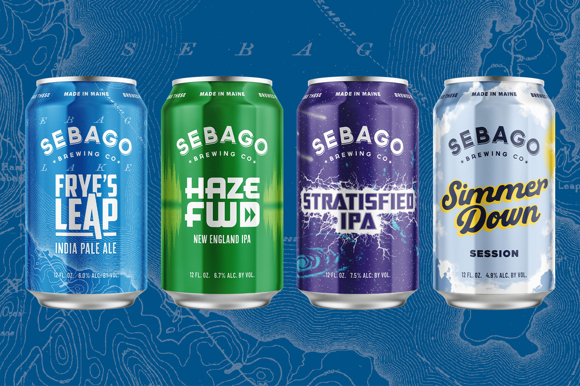
New cans, same delicious beer
The last time we revamped our core beer packaging was back in 2019. This summer we’re excited to announce a full redesign of our core beer lineup: Frye’s Leap, Haze FWD, Simmer Down, and Stratisfied! Simmer Down had the biggest transformation by far — blue sky and clouds replace the familiar yellow can.
We talked to Kai Adams, Co-founder and VP of Sebago Brewing, about the new packaging.
Why the change?
Several reasons, really, but as a craft beer business we need to respond to the market. It’s always important to stay fresh and stand out, especially in that crowded store cooler. For example, we often get to the point where our variety pack shifts to different beer combinations or new additions, so we have to change the packaging of our 12-packs.
Any other reasons for the update?
We wanted to give a boost to Simmer Down, one of our favorite beers. Simmer Down started as a seasonal beer, but it’s been year-round for a while now, and the new can communicates that better. You can experience that crisp, blue Maine sky in every season, not just summer. We love Simmer Down and we want more people to drink it!
Tell us more about the evolution of the can artwork.
Last year we did the Stratified can, which was new, and it inspired us to evolve the traditional SBC branding and artwork. The old designs were very structured and cohesive as a portfolio, but were starting to feel a little dated. We wanted to created more unique designs for each beer that were more clean and vibrant. We also went with a matte finish on the can, which not only feels more modern, it’s easier to photograph.
What elements of the core packaging did you want to keep?
We kept the type deign of each beer and the Sebago logo, of course. And we kept the one vertical band on all of the beers with the Sebago Brewing branding on it. It’s a challenge to redesign something that keeps loyal fans happy, so with a brand refresh, our team did our best to balance familiar elements while introducing new ones.
What’s your favorite can?
I love Frye’s Leap! We used an old topographical map of Sebago as inspiration. It was actually an old map that was one of the original pieces of art we had in our flagship brewpub in 1998! The map concept captured the feel of Frye’s Leap, and with less of that horizontal design it really opened it up. It’s my favorite new can!
How do the new cans fit into Sebago’s “big picture?”
One of our core company values is value for our customers. Since we opened, we’ve done our best to stay within a “value price point, and that’s been pretty hard to do in this industry. About two years ago, we decided to change can suppliers—from a big, multinational supplier to a smaller plant in New Hampshire. The previous company did a great job, but they’re massive. And now that we’re shipping from a place in New England, our freight costs have gone down almost 80 percent. It was a business decision with the goal of keeping the value for our customers.
We decided to go against the grain and leaned into new packaging while doing what we can to keep our pricing reasonable. Even though craft beer sales are down, we’ve beaten the trend all year.
Look for the new cans, 12-pack boxes, and new variety packs at all of our locations and wherever you buy your favorite beer.